GetFeedback:
Visual Designer
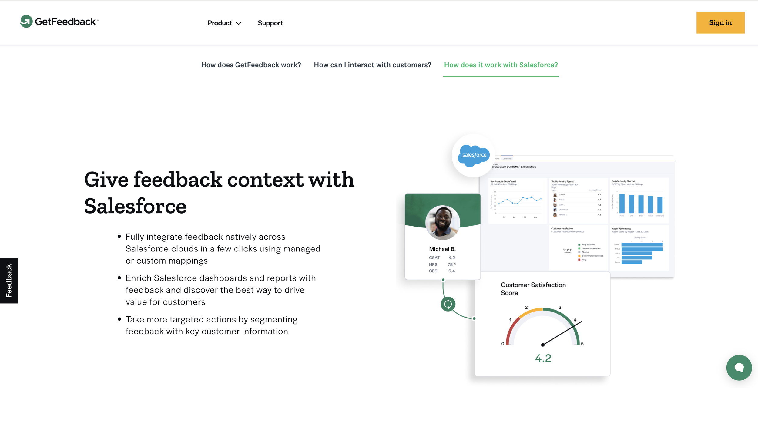
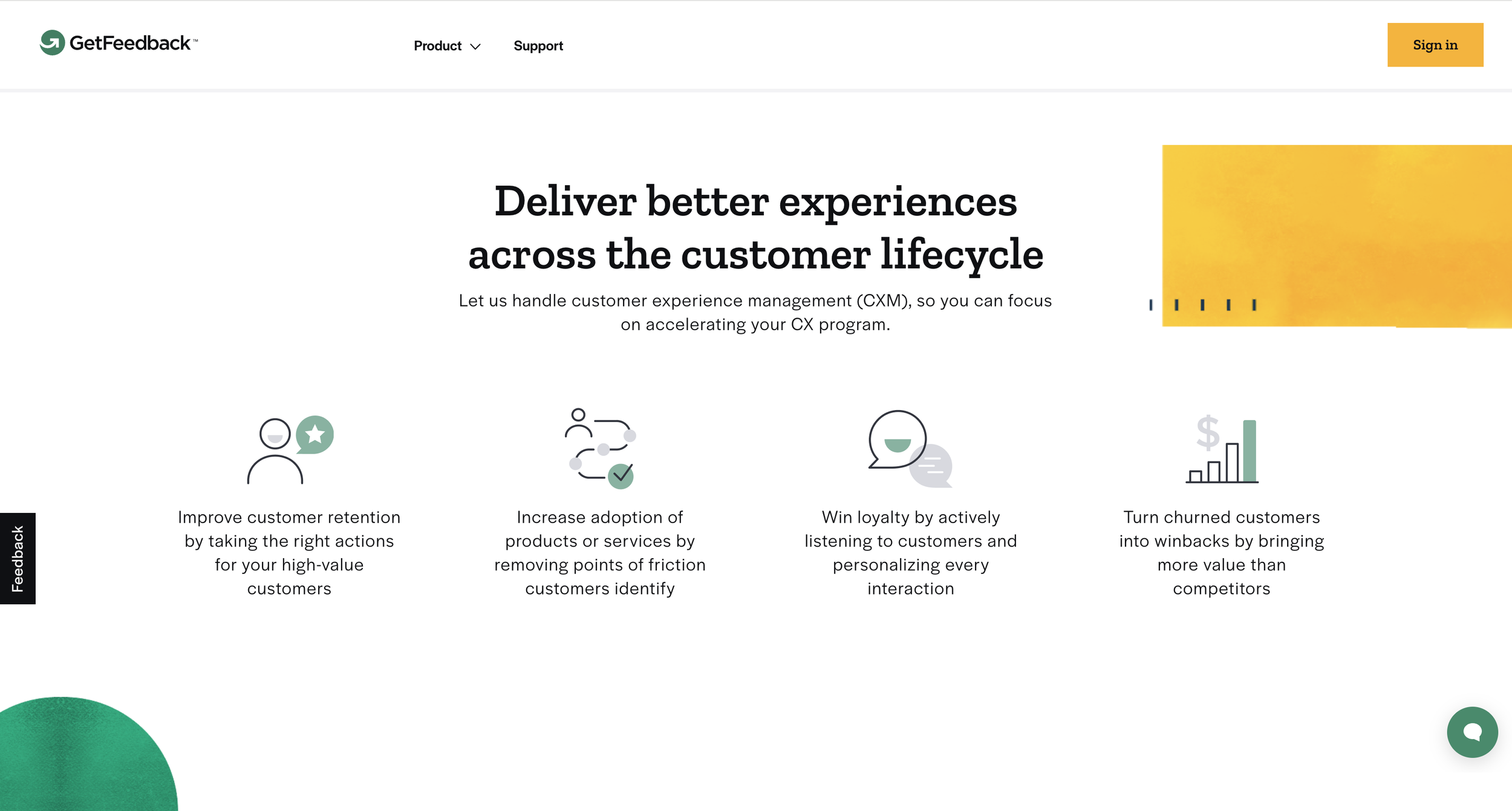
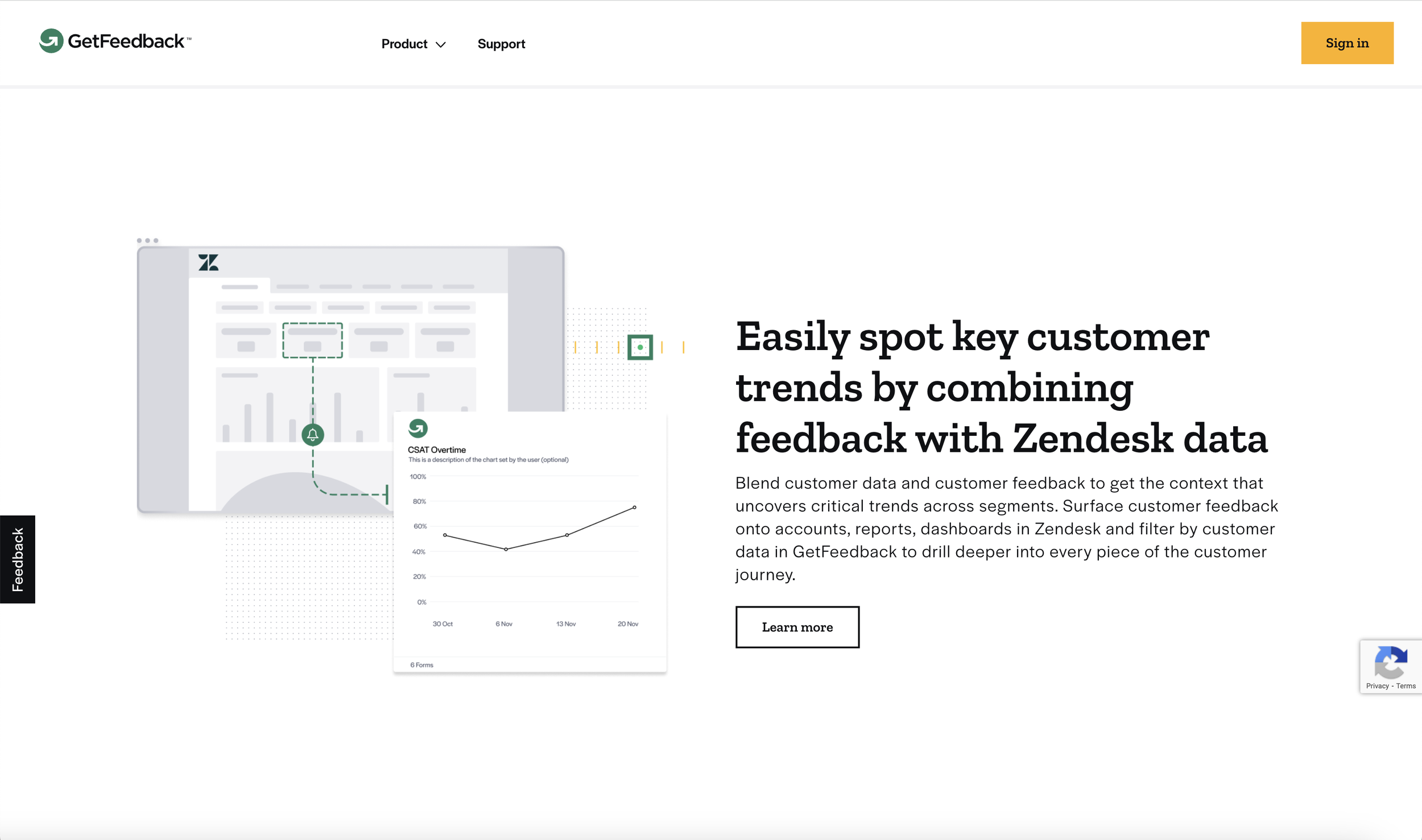
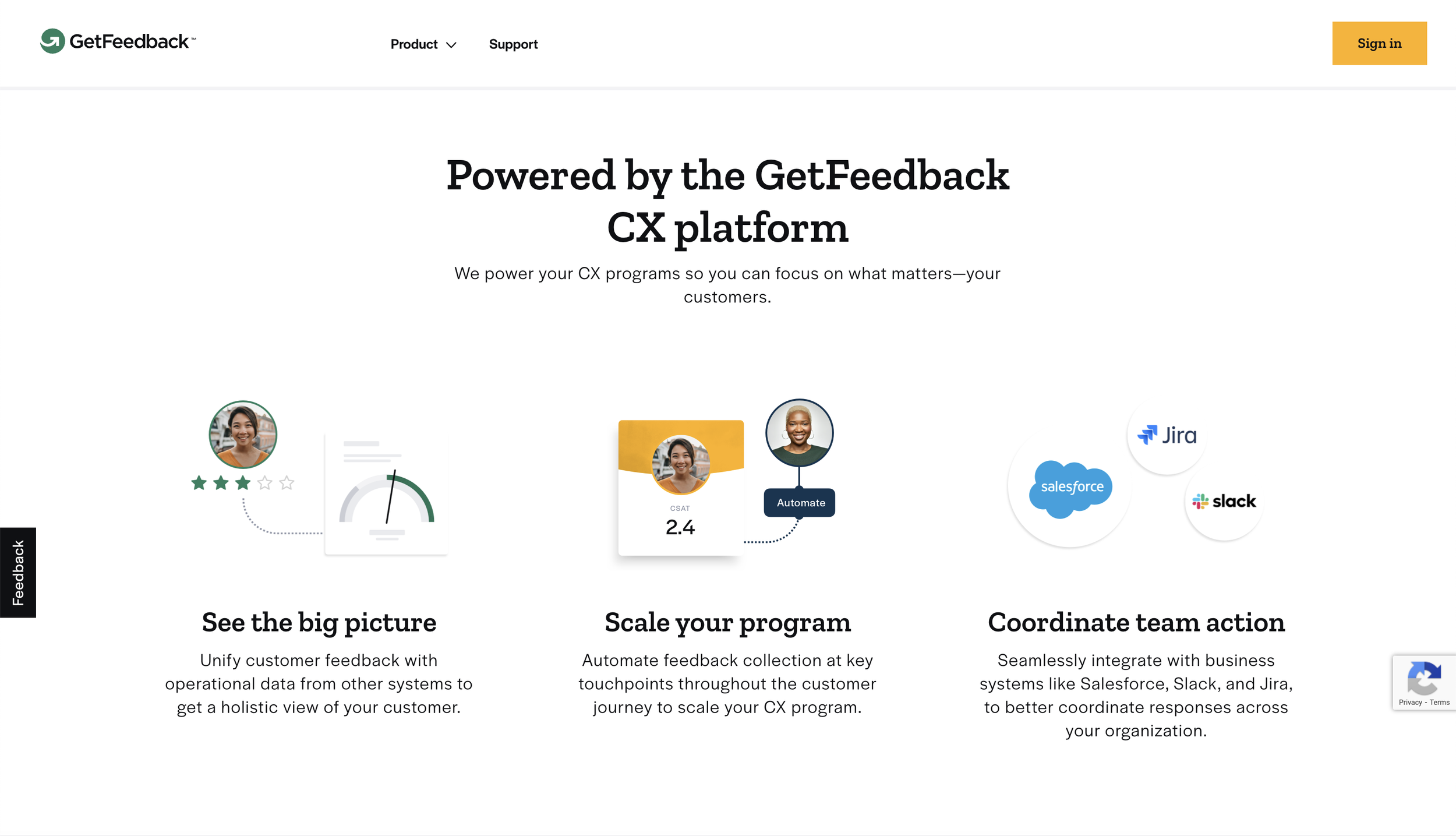
While working at GetFeedback I was tasked with creating a unique visual system to help explain complex concepts within the CX Space. These were used for marketing collateral as well as within the product itself. The language developed in the illustration system was also used as supplemental visuals in marketing graphics as well as elements of the webpage.
Marketing Graphics
The GetFeedback marketing graphics used the same visual elements and patterns to create a cohesive brand. Visually heavier elements like texture were reserved for hero graphics. The customer grid and customer journey line are featured prominently in these graphics to help illustrate specific situations and show the flow of the story.
Marketing Illustrations
I designed the GetFeedback illustration system to consist of a few core elements that could be repurposed throughout the images as textures and visual elements weaving all of the graphics and characters together. The illustrations utilize a simple palette that reinforce brand consistency through repetition. The faint dot grid structure, or customer grid, in the background serves as a visual metaphor for our customer base and allows a consistent visual base for our images. Utilizing the customer grid as the base, I then brought in lines that illustrated the customer journey.
Product Illustrations
The GetFeedback product illustrations used the same elements in the marketing visuals but paired back with a mostly tonal palette and less visual activity to allow the illustrations to help guide throughout the product and not distract from it.


